amy small
creative, brand, and organizational leadership
INSPIRING everyday coffee drinkers to 'pop a donut shop'
Challenge: After a few years without any marketing, Donut Shop wanted to reintroduce its K-Cup® coffee brand to the world. We found two simple truths to build on: Donut Shop coffee tastes good. Not gourmet, not extraordinary, not amazing. Just average, everyday good. And most people who buy Donut Shop for the first time (and even some loyal fans) say it's largely because they like the design of the box. Nothing earth-shattering, but it was enough to get us inspired.
Approach: When you don't have anything astounding to say that'll make people think, use what you do have to make people feel. So we developed the 'Pop a Donut Shop' campaign to play off the bright, poppy colors of the brand's packaging, infuse some happiness into a typically brown and muddy K-Cup® coffee category, and make the Donut Shop's bubbly and contagious personality its most endearing differentiator.
INTERACTIVE PRINT
For a brand that's inherently playful, we needed to make sure every interaction, even the static ones, tickled all of the senses. In the first print piece, the Donut Shop graphic elements are a series of bright peel-off stickers that people can use to colorize their coffee mug or Keurig® brewer, bringing a little visual joy to their mornings. And since people taste with their noses first, the second one was designed to be scratch-and-sniff, delivering a tantalizing whiff of great, er, good, coffee right from the page.
brand VIDEO
Happiness in sound and sight, pure and simple.
MORE GOODIES
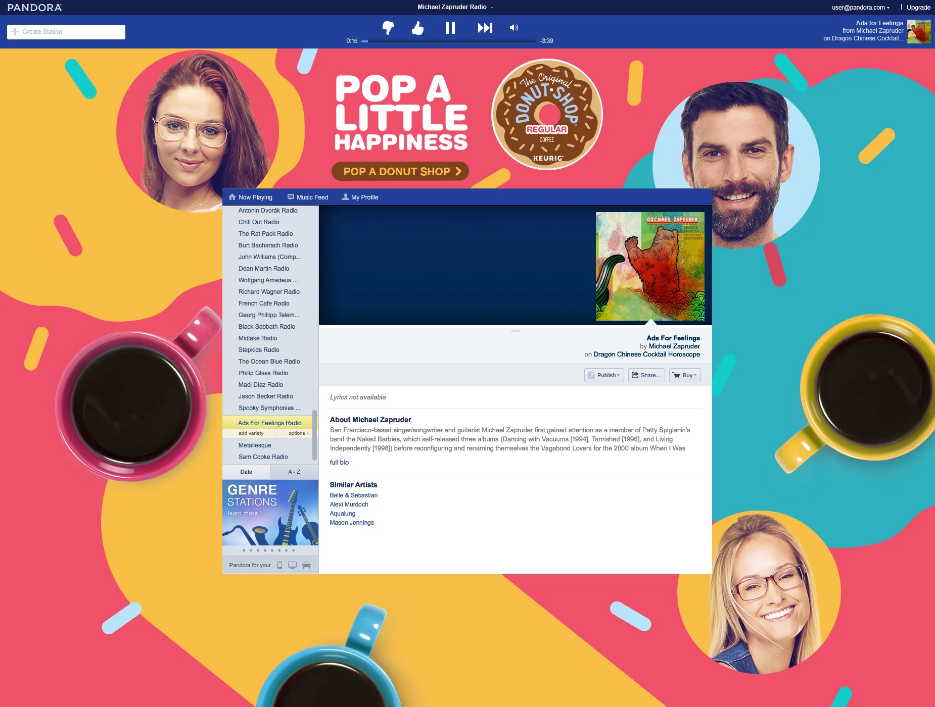
Pandora spots and takeovers, an unusual Waze directional ad (you don't have to drive anywhere off-route for good coffee if you already have it at home), in-store digital couponing, and a larger than life brewer experience.


